
A fresh face: rebranding Life Moments
Written by Mark Gotto
As our company grows and adapts to new challenges and opportunities, it has become clear that our brand needed to evolve as well.

Refresh
In today’s fast-paced and ever-evolving market, a brand’s identity is not just a logo or a colour scheme; it is a powerful representation of who we are and where we’re headed.
Our previous identity, while foundational, needed sharpening to better embody our innovative spirit and dynamic energy that we bring to our industry.

Placing the spirit of Life Moments at the heart of the new brand
In order to revamp our brand, it was important to understand what our brand stands for. We narrowed down the essence of our brand into one sentence.
A brand that is clean and friendly reflecting our dedication to accessibility, can be implemented fast for dynamic design decisions whilst reflecting the bold, transformative impact we are making on the financial services landscape.
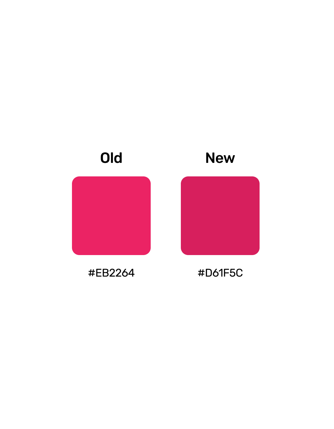
Hero pink
For our hero colour, we've chosen our pink from our original brand colours. After some consideration, we decided to go bold and select a darker shade to ensure we’re exceeding accessibility standards.
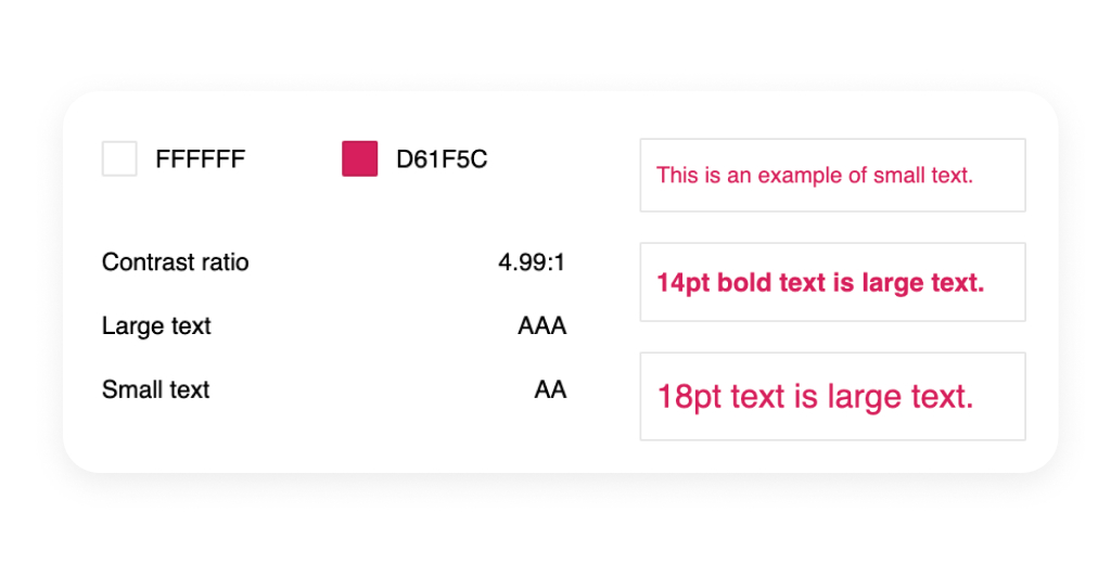
Accessible pink
Colour contrast accessibility is determined by the Web Content Accessibility Guidelines (WCAG).
WCAG defines accessible colour contrast in terms of a "contrast ratio" between text (foreground) and its background.
The contrast ratio is a number between 1:1 (no contrast, identical colours) and 21:1 (maximum contrast, black on white).
Our new chosen pink passes all instances of accessibility with the passing ratio being 4:5.
Illustrations
Through vibrant colours, clean lines, and thoughtful symbolism, our illustrations reinforce the message that we are not just about selling products; we are about improving financial wellbeing.
Fonts
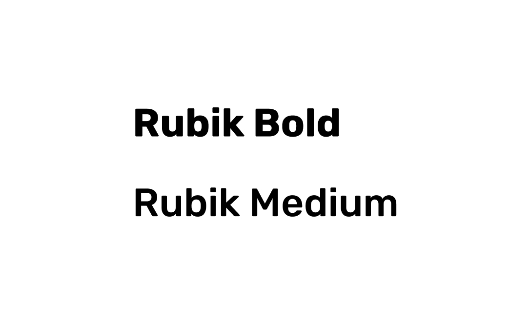
We have made the decision to update our heading font from Rubik Bold to Rubik Medium. This change is driven by several key considerations:
Modern Aesthetic: The use of a lighter font weight aligns with a more sleek, minimalist, and contemporary design approach.
Balanced Visual Impact: By opting for a medium weight, we maintain the emphasis on headings while ensuring a more balanced and refined visual hierarchy.
Enhanced Contrast: A lighter heading weight provides a subtle yet effective contrast. This contrast improves readability and contributes to a more harmonious and visually engaging layout.
Implementation
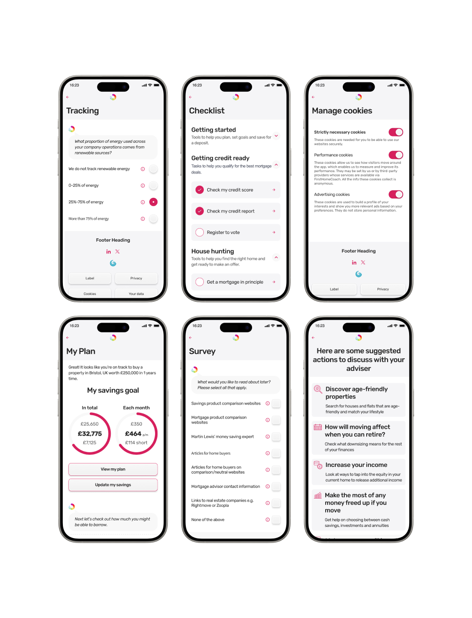
Much of our work involves creating mockups for clients, which is why it was crucial for us to develop a neutral colour palette. This choice ensures that the focus remains on the tools themselves, minimising distractions and clearly conveying that these products are unbranded.
Combining all these elements is where our design journey begins, leading to the impactful experiences we create for the end users.